Once
you have a well-ordered set of items and a good navigational system,
select a presentation style for the layout of the entire questionnaire.
Here, considerations will differ, depending on whether you are using
a paper (hard-copy) or electronic (computer-based) mode of
delivery.
A) The paper questionnaire. If your questionnaire has more
items than can be displayed on one page, consider how a respondent
will read items across multiple pages. In general, it's wise to
use regular letter-sized paper and print on one side only, being
careful to ensure that items do not break across pages. If the
questionnaire is printed on 11" x 17" paper, it can
be folded into a letter-size booklet whose pages can be turned
magazine-style.
If
your questionnaire consists mostly of predetermined-choice items
with answers running vertically, they will be easier to read if
they are placed in a two-column format (a single item running
across the entire width of a regular page is difficult to follow).
|
Survey 1 (Single-column)
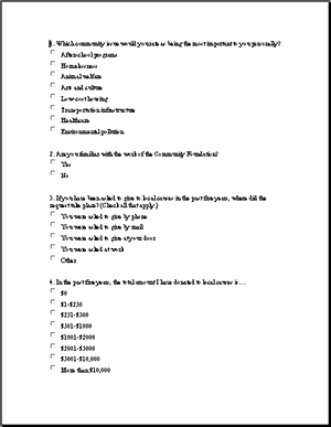
|
Survey 2 (Two-column)
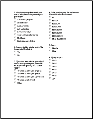
|
|
Figure 4. Single-column and two-column
formats.
It
is also helpful to have each item appear as a discrete block of
text, meaning that the spacing between items should be greater
than the spacing within each item (see Figure 5).
|
Survey 1 (Less effective spacing)
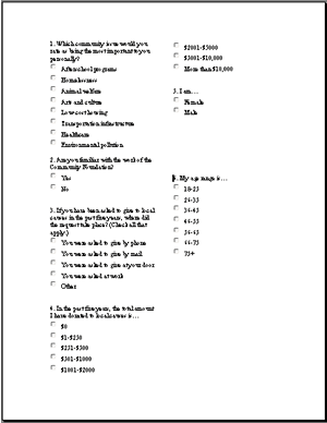
|
Survey 2 (More effective spacing)
|
|
Figure
5. The right-hand example uses white space more effectively to
visually separate the items.
Other
graphic features also affect the appeal of a questionnaire. If
you have made sure the items have a consistent style and navigational
cues (Step 3), make sure that all the
pages also have a consistent
layout and style. For example, every time directions appear, differentiate
this text by size (or style) and, possibly, by boxing it. Shading
also can be used to enhance an entire set of pages. There is some
evidence that more items will be answered if entire pages are
shaded a very light gray (or other color) with the response boxes
left white. Shading must be light enough so that text is readable.
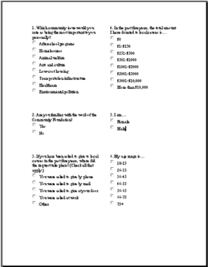
It
is also important to lay out a questionnaire so that it can be
scored easily. In the example below (see Figure 6), note that
scorers would have to move their eyes across the page to see the
answers to question 2.
Figure 8. Adding letters to checkboxes can make scoring much
easier.
Note that an "Other" choice allows the respondent to
write in an answer. Although this open-ended data may be valuable,
transcribing it also will slow down the scorer substantially.
When designing a questionnaire, always keep in mind the resources
available for scoring the returns. See
the Developing
Written Questionnaires: Writing Questionnaires Module for
more about when it is appropriate to include open-ended items.
A
final consideration is the cover. For a short questionnaire (one
or two pages), a cover may reduce the response rate because it
suggests something lengthy. For a longer questionnaire, however,
a cover makes the questionnaire stand out from other sets of desktop
papers. Dark front covers with simple graphics, a short title
(e.g., "Math Teacher Survey"), and the name or logo
of the sponsoring organization may be easiest to remember and
locate. The back cover can be used for a thank-you and an invitation
for additional comments.
B) The electronic questionnaire. Presenting
a questionnaire via e-mail or the Web presents unique challenges.
Foremost is ensuring that the recipient sees what is intended
on his or her computer screen. Because of differences in operating
systems and browsers, a questionnaire on a designer's computer
screen may not appear as intended on the screens of different
recipients. Although this is not the place for a set of technical
computer guidelines, there are nonetheless several simple ways
to reduce problems and confusion.
First,
keep paragraphs short to increase the likelihood of maintaining
intended formatting from one system to another; long paragraphs
may wrap differently on screens of lower resolution than the
designers'.
Second, use simple, fast-loading graphics in colors from standard
Web palettes (that is, sets of standard colors that look the
same on all browsers).
Third, display explicit navigational cues to indicate how a respondent
is to move through text that exceeds one screen. For example,
do not assume that all respondents are adept at scrolling down
a screen. If pilot testing (see Step 5) shows that some users
do not realize they need to scroll to see additional questions,
consider presenting the questionnaire in a format where questions
appear one or two at a time and users click "next" or
"back" buttons to move through them.
Fourth,
respondents should experience each screen in the most succinct,
uncluttered way possible. For example, rather than encountering
a cover page and lengthy directions, they should see a brief set
of directions and start answering questions on the very first
screen. Also, although a two-column format for predetermined-choice
questions may work well on paper, it usually works poorly on the
screen. A better alternative is to run the items vertically in
a single column.
Graphic
style for individual items should follow the same design principles
as on paper questionnaires, but there are some styles that cannot
be used on electronic questionnaires. The respondent cannot circle
choices, handwrite, or check off blanks. Instead, electronic questionnaires
use radio buttons, checkboxes, and text boxes. Radio buttons
are used when the respondent is to select only one choice, checkboxes when the respondent is allowed to select more than one choice,
and text boxes when the respondent is to type
comments.